
How to make a product campaign feel cohesive without making every image the same
A cohesive product campaign doesn’t need every image to look the same.
In fact, if every frame uses the same composition, crop, and visual weight, consistency quickly becomes repetition.
For this Le Mini Macaron study, I wanted to build a broader image system around a very specific set of constraints: one distinctive bottle shape, a consistent cap color, and a range of saturated nail polish shades.
The goal was to make the collection feel unmistakably connected while giving each image a different role.
Start with the rules
The foundation of the series stayed intentionally consistent.
The lighting remained bright and graphic, with enough softness to preserve the translucent quality of the bottles and enough contrast to hold the shape of the packaging. The backgrounds stayed light and minimal. Color came primarily from the products themselves.
Those decisions established the visual world.
Once that system was in place, the compositions could change without the work losing cohesion.
Build range through composition
Rather than photographing eight versions of the same hero shot, I treated the collection as a set of visual building blocks.
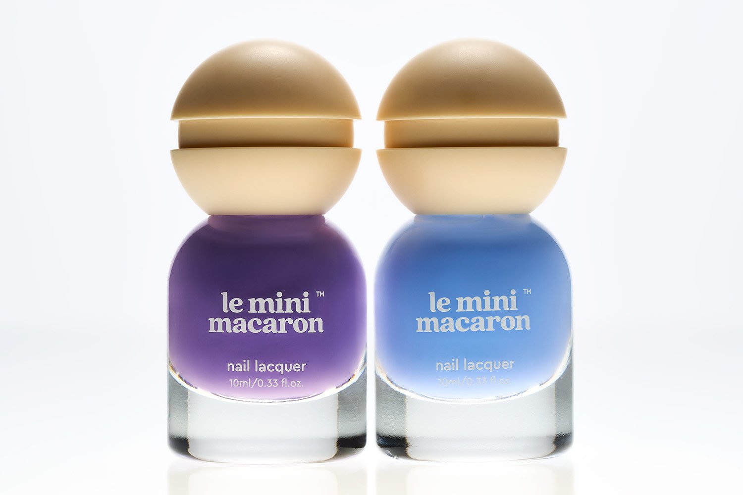
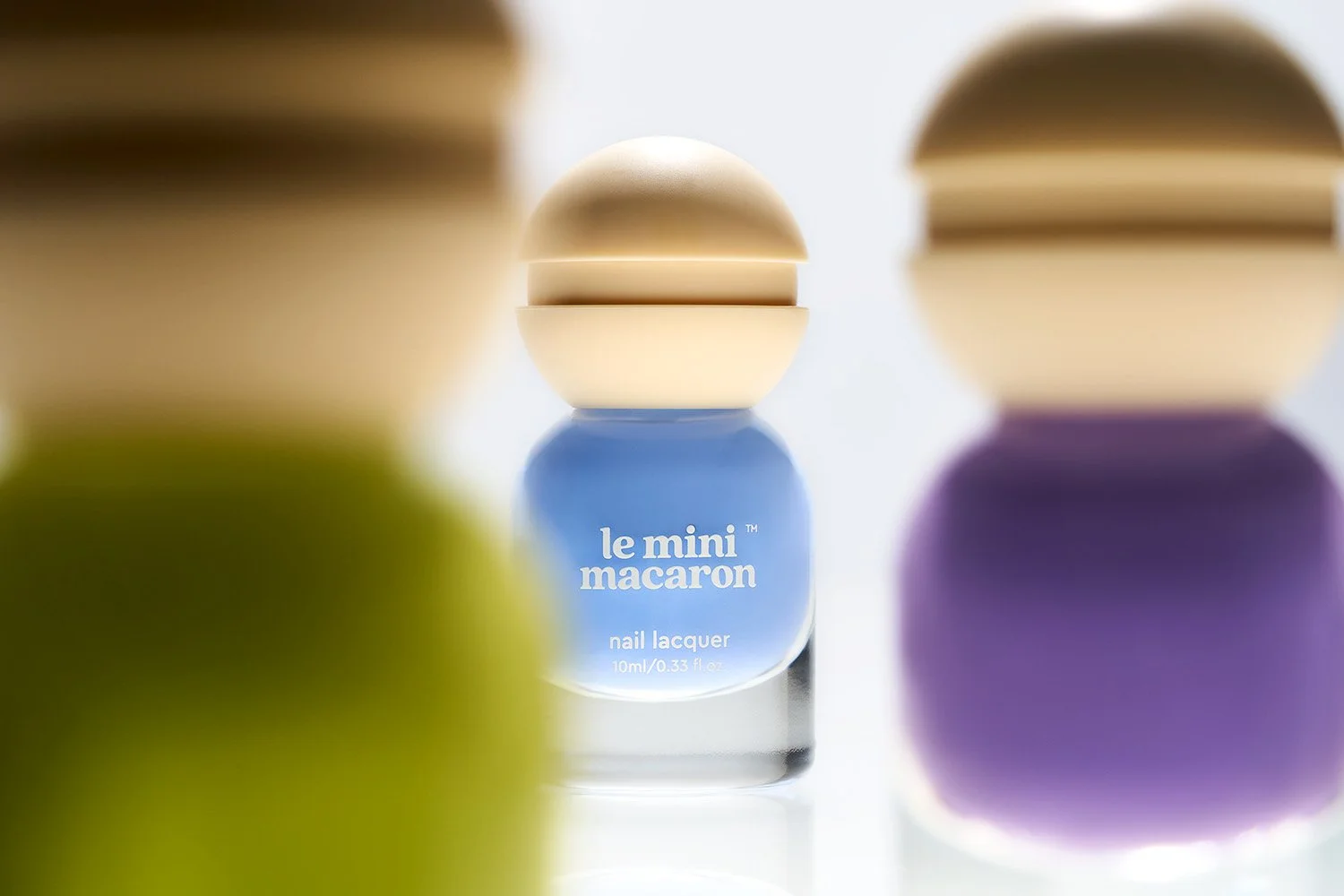
Some images isolate a single bottle and give the product room to stand on its own. Others use pairs or groups to create rhythm through repeated shapes and contrasting colors.
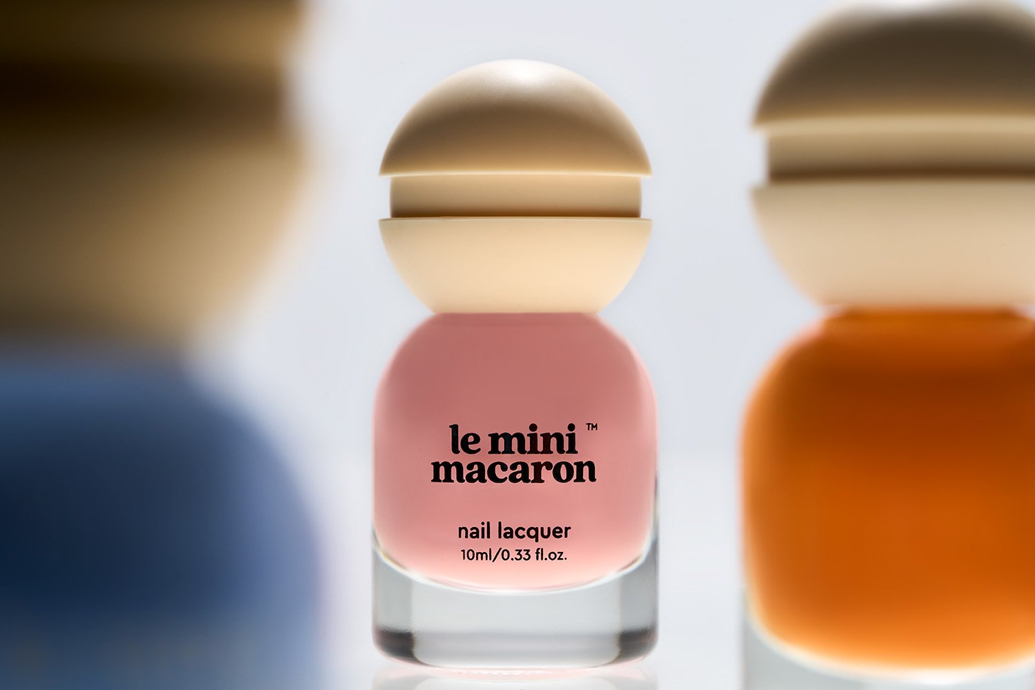
Foreground elements introduce depth and make some of the images feel more immersive. Tighter crops shift attention away from the full product and toward smaller details.
The point wasn’t variation for its own sake. Each change creates a different kind of asset.
Let the packaging become part of the concept
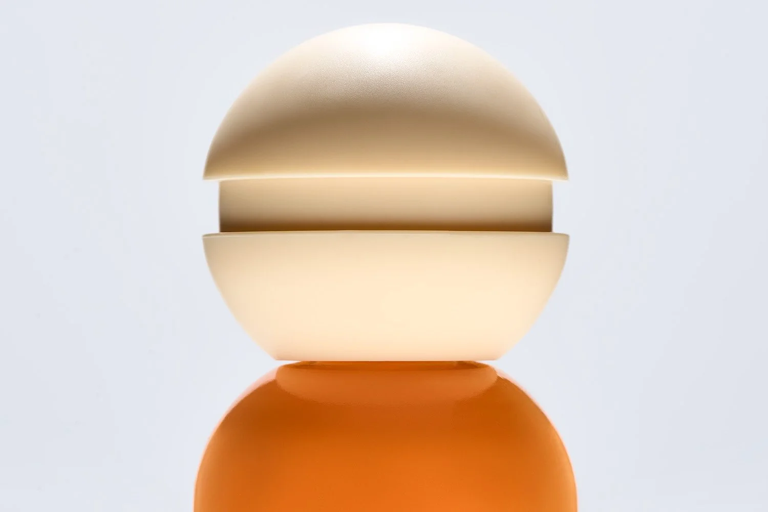
Le Mini Macaron’s bottle design is unusual enough that the packaging itself deserves attention.
The rounded cap and compact proportions create a silhouette that’s immediately recognizable, so several compositions were built specifically around that shape.
Instead of treating the bottle as a neutral container for color, I used its form as part of the visual language of the series.
That distinction matters in product photography. Sometimes the strongest brand cue isn’t a logo or a prop. It’s the object itself.
Move closer when the product changes
The polish offered another source of variation.
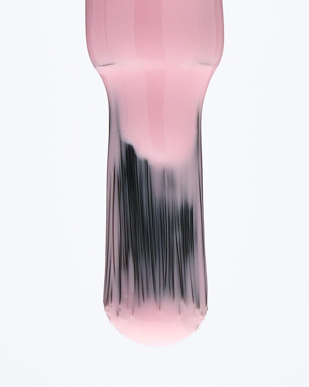
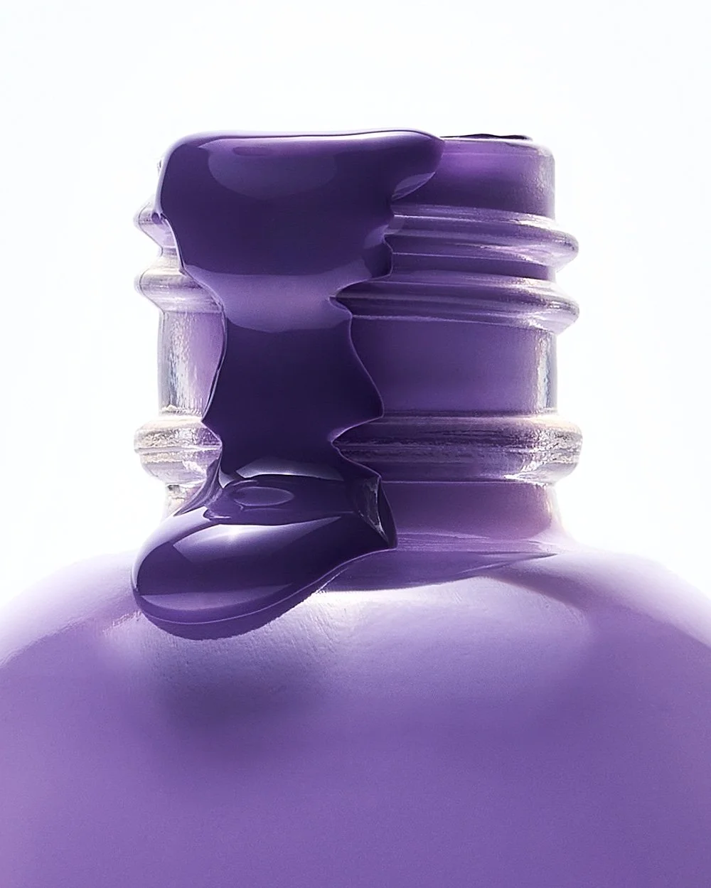
Once the brush, drips, and texture enter the frame, the images stop being purely about packaging and start showing the material qualities of the product.
Those closer details add a different kind of energy to the library. They can feel more tactile, more editorial, and more suited to placements where a straightforward product hero would be too static.
They also give the collection a visual break from repeated bottle shapes while staying completely within the same world.
Consistency comes from shared rules
A strong image system doesn’t require identical compositions.
It requires enough shared decisions that every frame still feels related.
Lighting, palette, background, product treatment, and overall visual tone can remain consistent while scale, crop, grouping, depth, and subject hierarchy change from image to image.
That balance is what gives a product library range without making it feel fragmented.
For a brand, that means one shoot can produce clear heroes for web, tighter details for social, supporting imagery for email, and compositions that can carry a campaign across multiple placements.
Strong libraries are built on range, not volume. Each image should have a reason to exist.
Need a product library that can create range without losing consistency?
I create still-life and product photography systems designed to work across campaign, ecommerce, email, and social.