
Holiday product photography without the usual Christmas clichés
Holiday photography comes with an unusually established visual vocabulary. Ornaments, bells, bows, wrapped gifts, candy canes work because we recognize them instantly. Put enough of those elements into a frame and there’s little ambiguity about the season.
But holiday imagery doesn’t have to depend on objects whose primary job is to announce Christmas.
The more interesting question is: what actually makes this time of year feel visually distinct?


Building the season through material
A lot of seasonal communication happens through material before it happens through iconography.
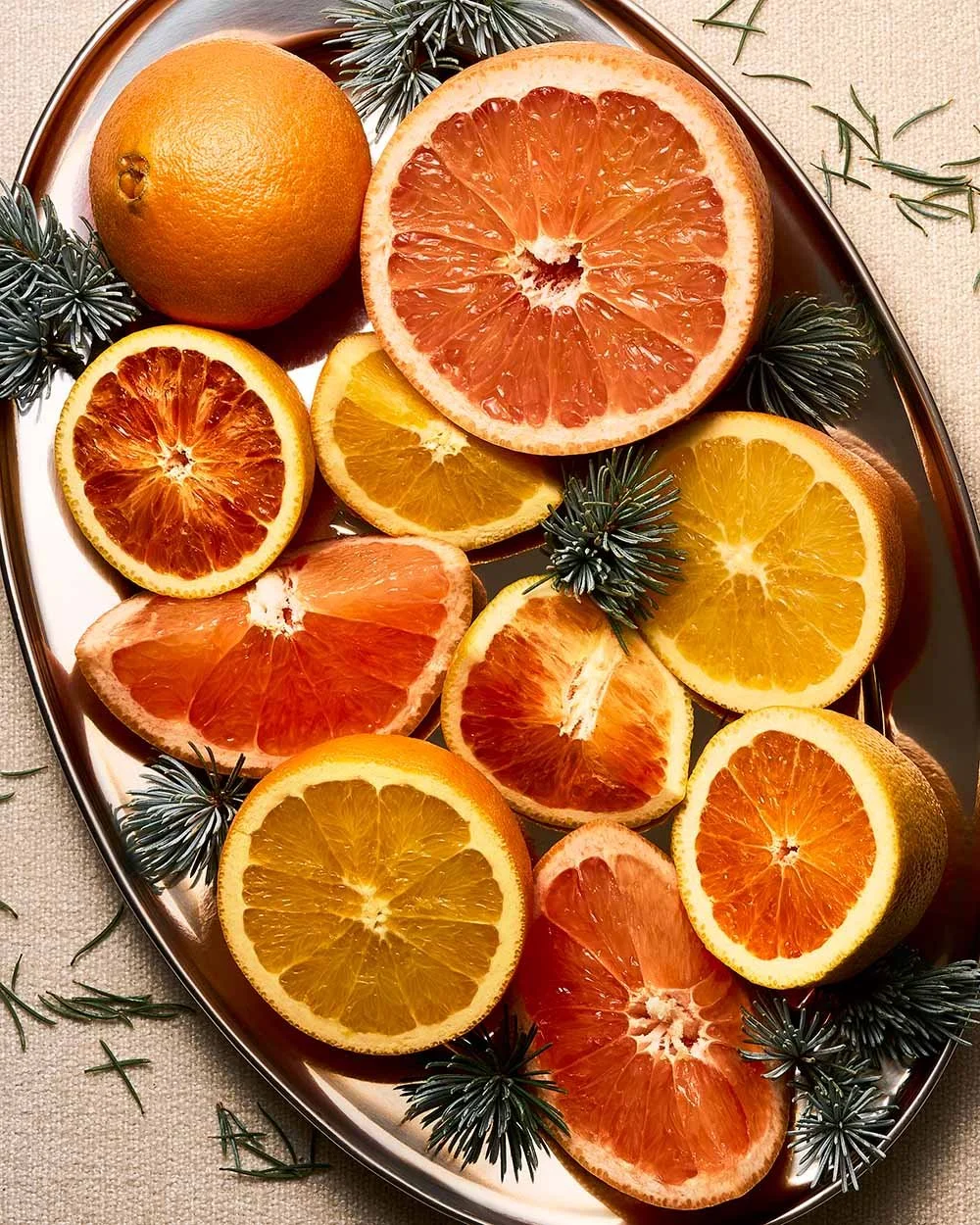
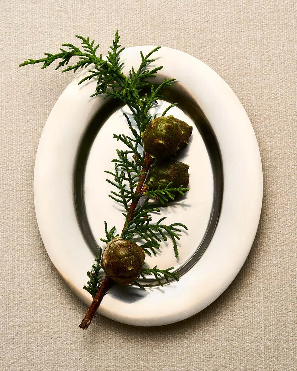
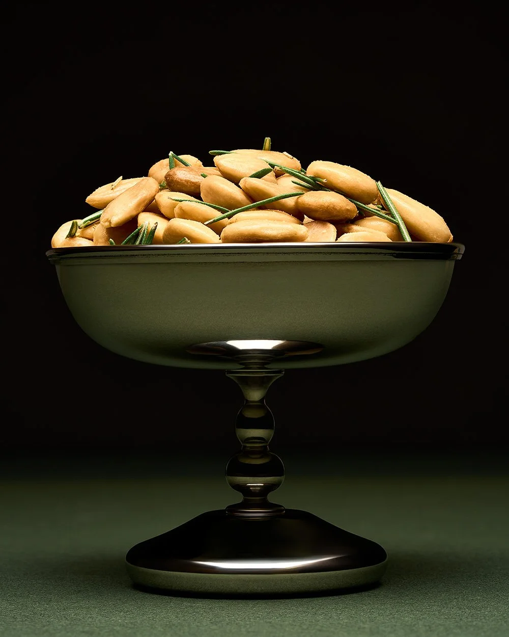
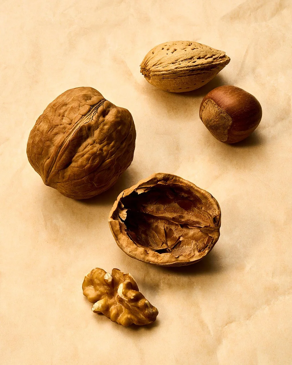
Citrus brings brightness and abundance. Rosemary and winter botanicals introduce deep, structural greens. Dark fabric adds weight. Reflective surfaces, smoke, fruit, nuts, glass, and organic forms carry associations with gathering, food, ritual, and winter without becoming literal decorations.
Individually, none of those things says “holiday.” Together, they start to.
Color, texture, scale, and form can create the association without requiring a recognizable seasonal symbol in every frame.
Letting light carry the season
Light can carry just as much seasonal information as the objects in the frame.
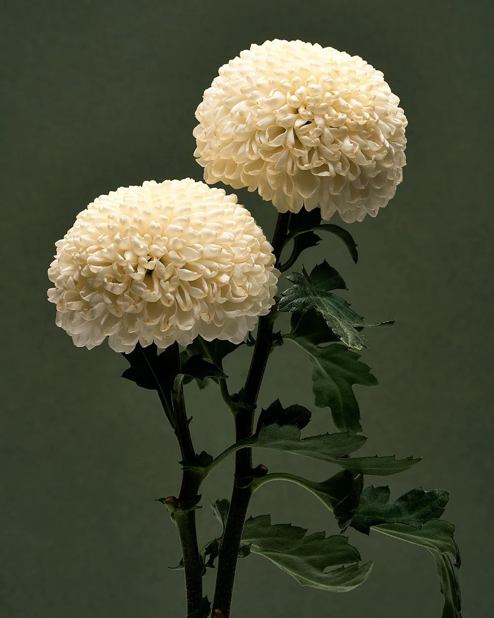
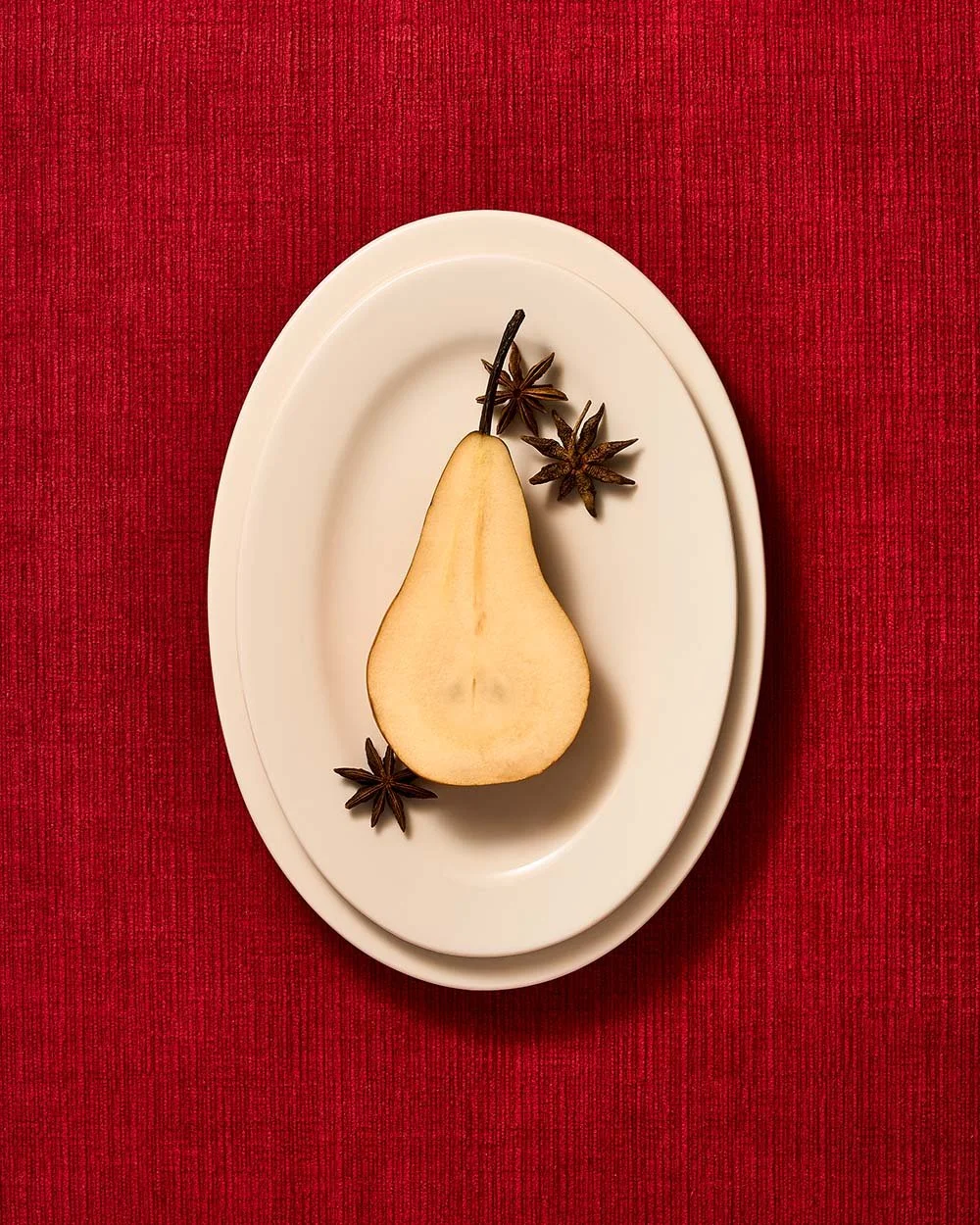
Holiday imagery is often pushed toward warmth, softness, and nostalgia, but that’s only one visual language available. Contrast between brightness and depth can feel just as seasonal. Clean whites can sit against dark greens and reds. Highlights can feel sharp and generous. Shadows and falloff can introduce richness without pushing the image toward traditional Christmas still life.
The season can be communicated through atmosphere rather than decoration.
Less specificity creates more range
There’s also a strategic advantage to working this way. The more literal an image becomes, the narrower its useful window.
An image built around a Christmas ornament is highly specific. An image built around winter color, abundance, botanicals, citrus, light, and texture can live across a much broader part of Q4.
That gives brands more flexibility around campaign timing. The same visual world can support a holiday launch, a gifting campaign, a November email, a winter homepage, or year-end social creative without feeling tied to the narrowest weeks of the gifting season.
Seasonal work can still create a strong sense of occasion without giving up versatility.
Holiday as a visual system
Holiday doesn’t have to function as a collection of symbols. It can function as a visual system.
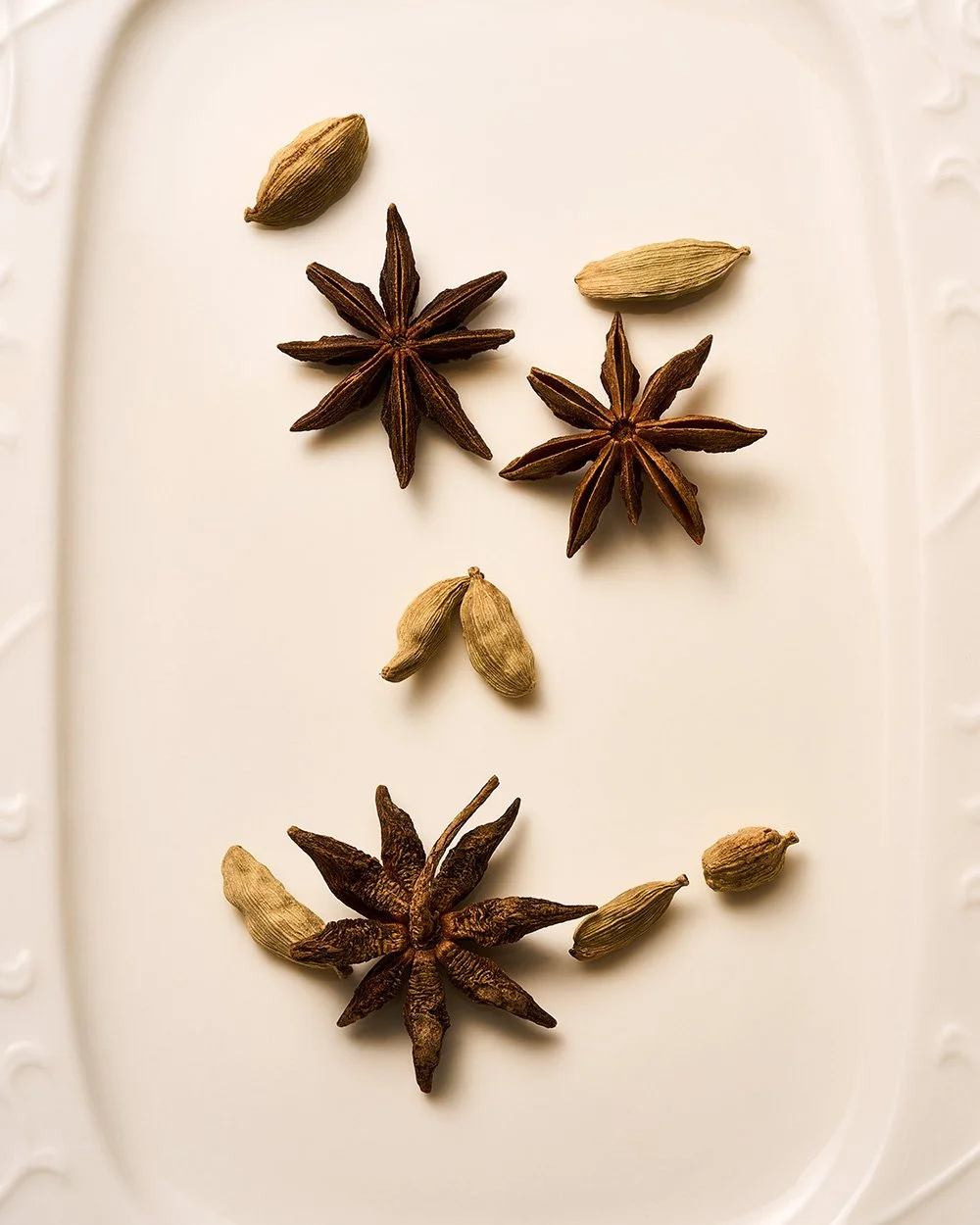
Seasonality can come from a palette. A material. A quality of light. A feeling of abundance. The relationship between something lush and something spare.
That approach leaves more room for the product, the brand, and the image itself while still making the season legible.
The familiar symbols are one way into holiday. They’re just not the only one.
Planning holiday or seasonal imagery?
I create concept-led still-life and product photography for brands that need seasonal imagery to feel distinctive while working across campaign, ecommerce, email, and social.