
MOCO Fragrances: building a campaign around changing states
Seasonal imagery often starts with recognizable visual cues. Summer can be communicated through sunlight, fruit, water, saturated color, or outdoor settings. Those references establish the season quickly, but they can also make the season itself the primary subject.
For this late-summer campaign for MOCO Fragrances, the visual concept was built around a different characteristic of the season: transition.
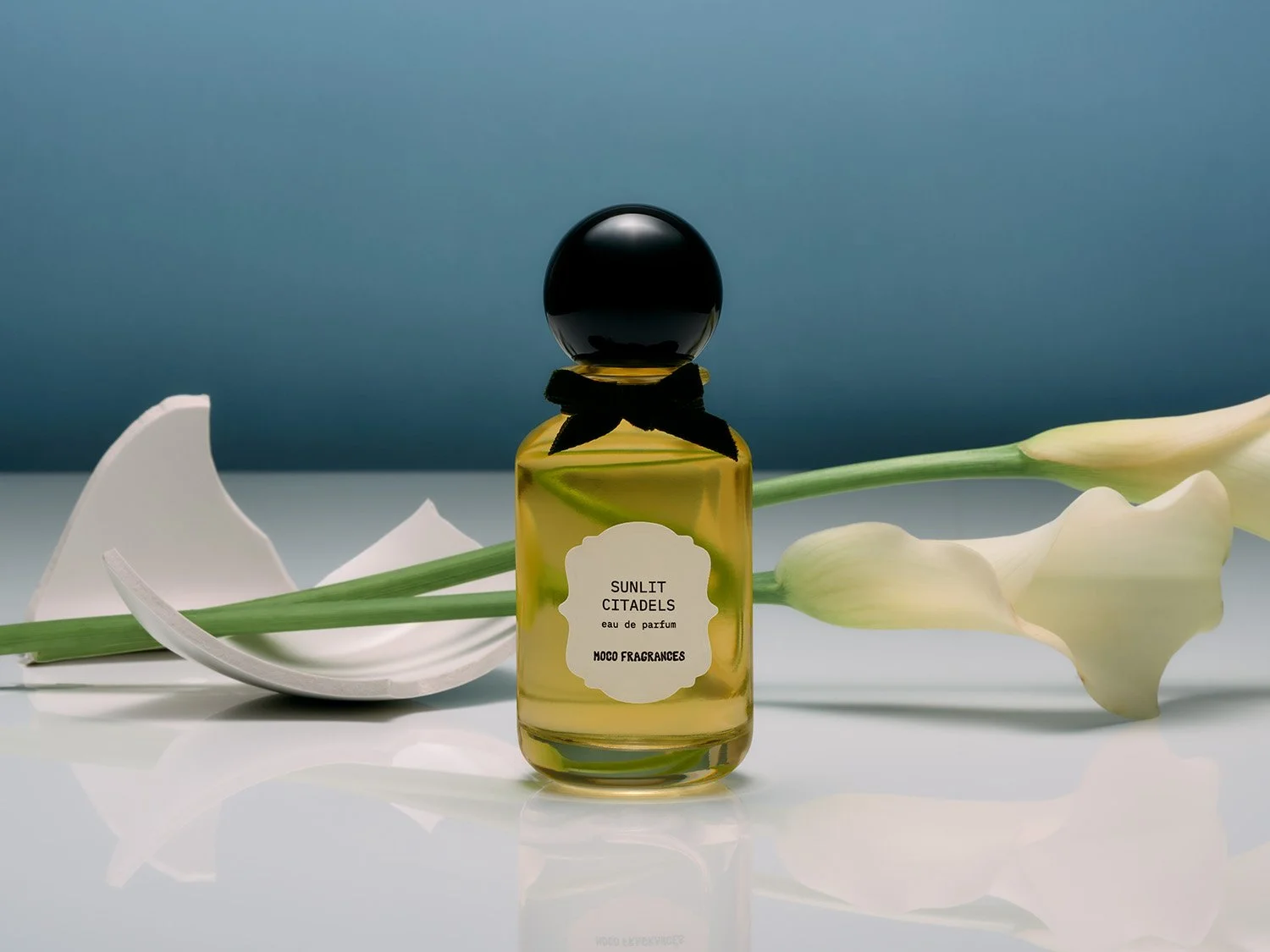
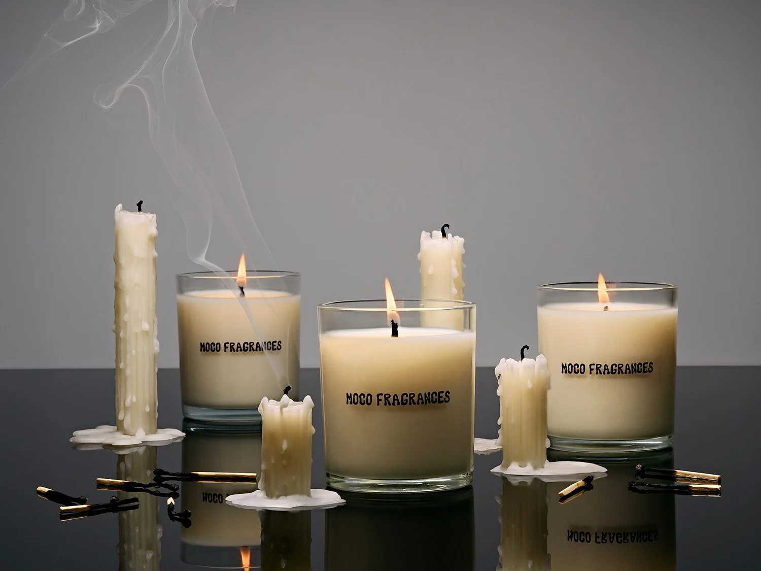
Rather than depicting late summer literally, each setup focuses on a material moving from one state to another. Flowers fade, balloons lose volume, wax melts, objects fall, and contained materials spill. The result is a campaign in which the season is communicated through physical behavior rather than seasonal shorthand.
Transformation as the visual structure
Five changing states established the framework for the series: fresh to fading, full to spilled, inflated to deflated, upright to fallen, and solid to melted.
Each transformation creates a different visual problem. A wilted flower behaves differently from a deflated balloon; melted wax introduces different shapes and surfaces than something spilled across a set. The compositions therefore do not depend on repeating the same props, arrangements, or gestures from image to image.
What connects them is the underlying action.
That structure allows each photograph to operate independently while still belonging to the same campaign. The consistency comes from the idea being repeated, rather than the composition.
Material behavior becomes part of the image
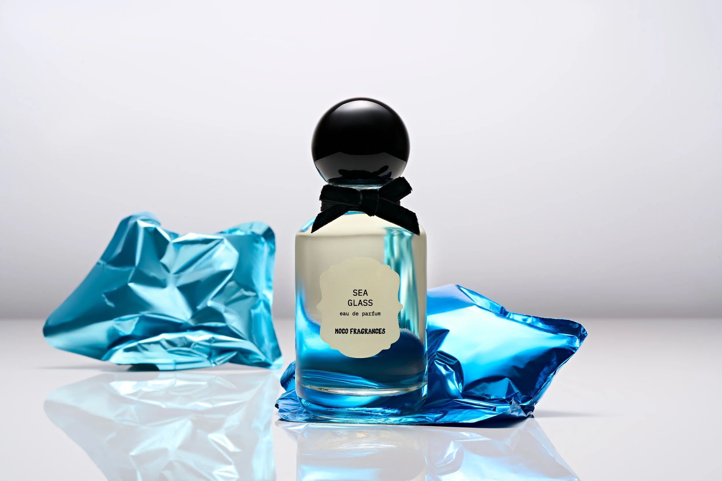
Props in still-life photography are often selected primarily for visual characteristics such as color, texture, shape, or scale. Here, their physical behavior was equally important.
Flowers needed to move from structured to spent. Balloons needed to retain enough form to remain graphic while visibly losing volume. Wax needed to soften and spread without becoming visually uncontrolled.
Those changes introduce an element that cannot be designed entirely through placement. Gravity, heat, time, and the properties of the materials begin to influence the final shapes within the frame.
The role of styling becomes less about placing a finished object and more about creating the conditions for a particular transformation to happen.
Controlling disorder
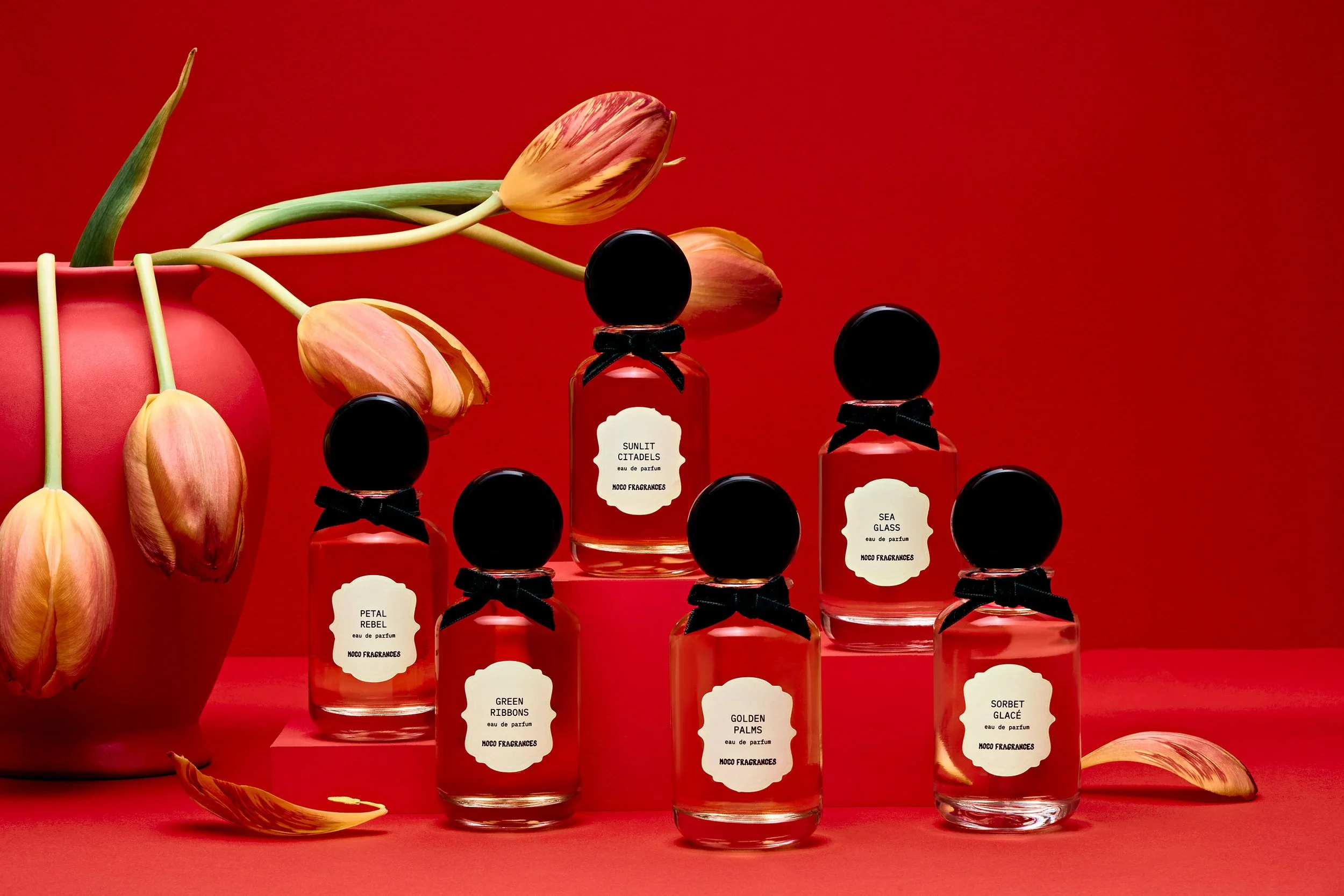
Collapse, spilling, and melting naturally introduce irregularity. Left unresolved, those behaviors can make an image feel accidental rather than intentional.
The surrounding visual structure therefore remains controlled. Compositions are graphic, color relationships are deliberate, and negative space gives the changing materials room to register clearly.
That contrast is what allows the transformations to remain legible.
The images can suggest something falling, fading, or losing structure without allowing the composition itself to do the same.
The product remains the constant
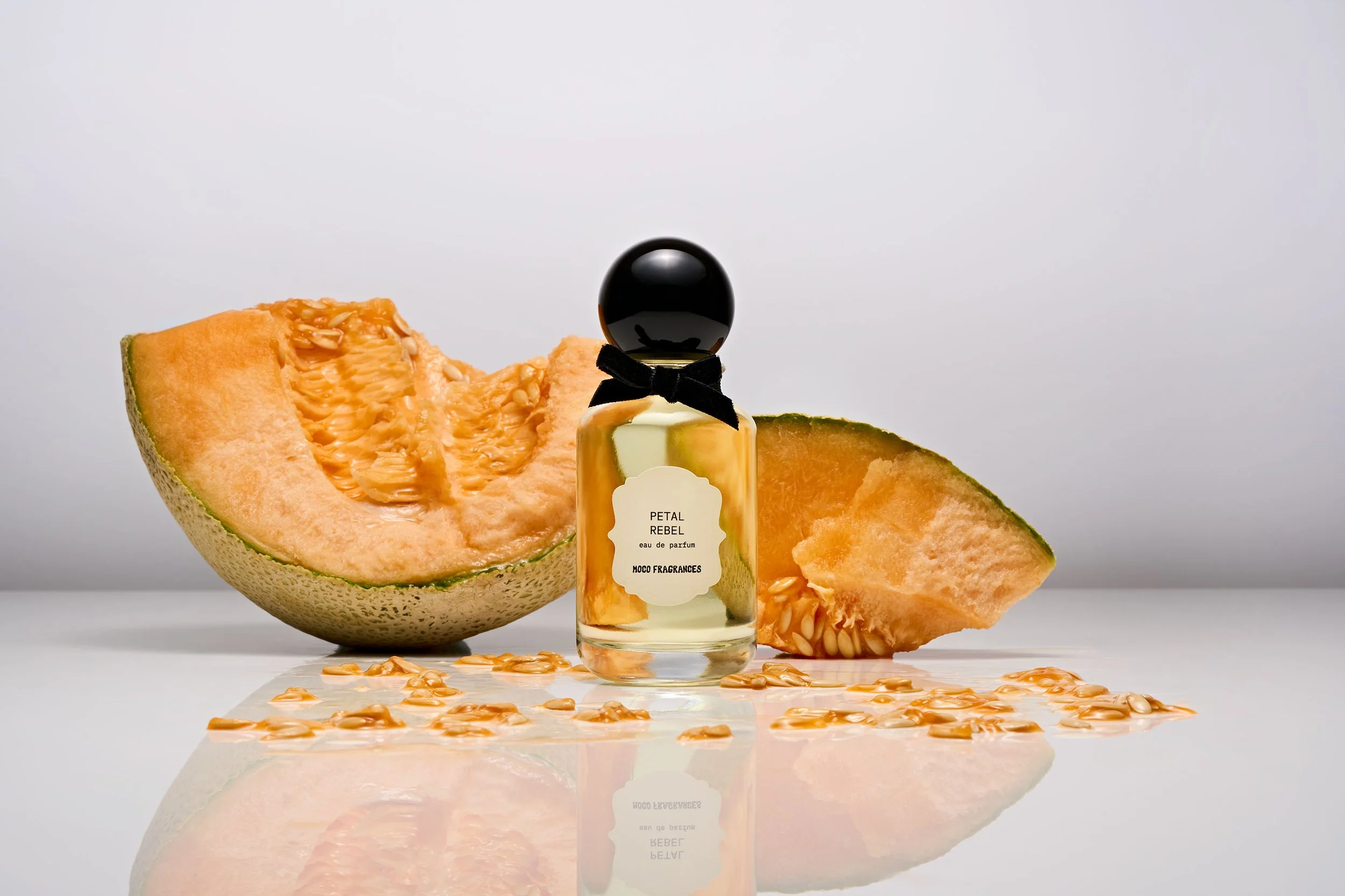
The fragrance bottles do not undergo the transformation. The changing state happens around them.
This distinction establishes a hierarchy between product and concept. Wax can melt, flowers can fall, and objects can lose their original form while the bottle remains visually stable within the composition.
The concept therefore adds narrative without requiring the product itself to become secondary to the set.
Across the series, the same relationship repeats in different forms: a fixed product surrounded by something temporary.
The campaign uses that tension to describe late summer not as a collection of familiar objects, but as a point of transition. The season becomes visible through what the materials are doing rather than through what they represent.
Planning a campaign or product shoot?
I help brands define the image library they actually need before production begins, then build still-life and product imagery designed to work across the full rollout.