
Rebel Bunny: building a visual system around product and packaging
Rebel Bunny already came with a strong visual vocabulary: graphic packaging and a product whose color is immediately recognizable.
The opportunity wasn’t to add another aesthetic layer on top of that; the photographic challenge was to create coherence without flattening that variation.
Rather than relying on a single palette or repeated composition, the series uses a consistent visual structure across changing product relationships, scales, and arrangements. Packaging, product, color, and texture move in and out of prominence from frame to frame, while the overall image system remains connected through composition, lighting, and graphic balance.
The result is a body of work that allows individual images to feel distinct without losing continuity across the series
Product and packaging as one visual language
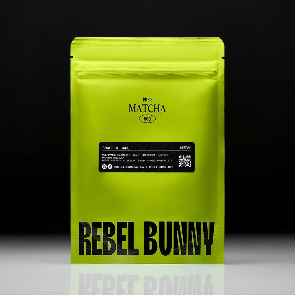
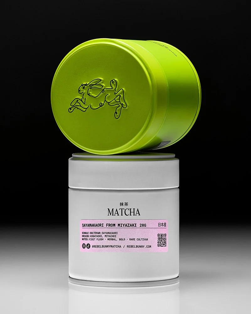
Packaging can easily become a secondary element in product photography, treated primarily as something to document alongside the product itself. In this series, it functions as part of the image-making material.
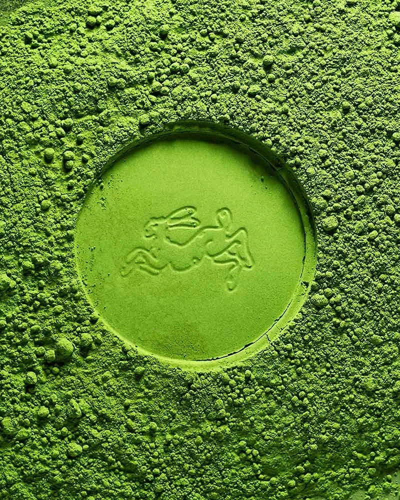
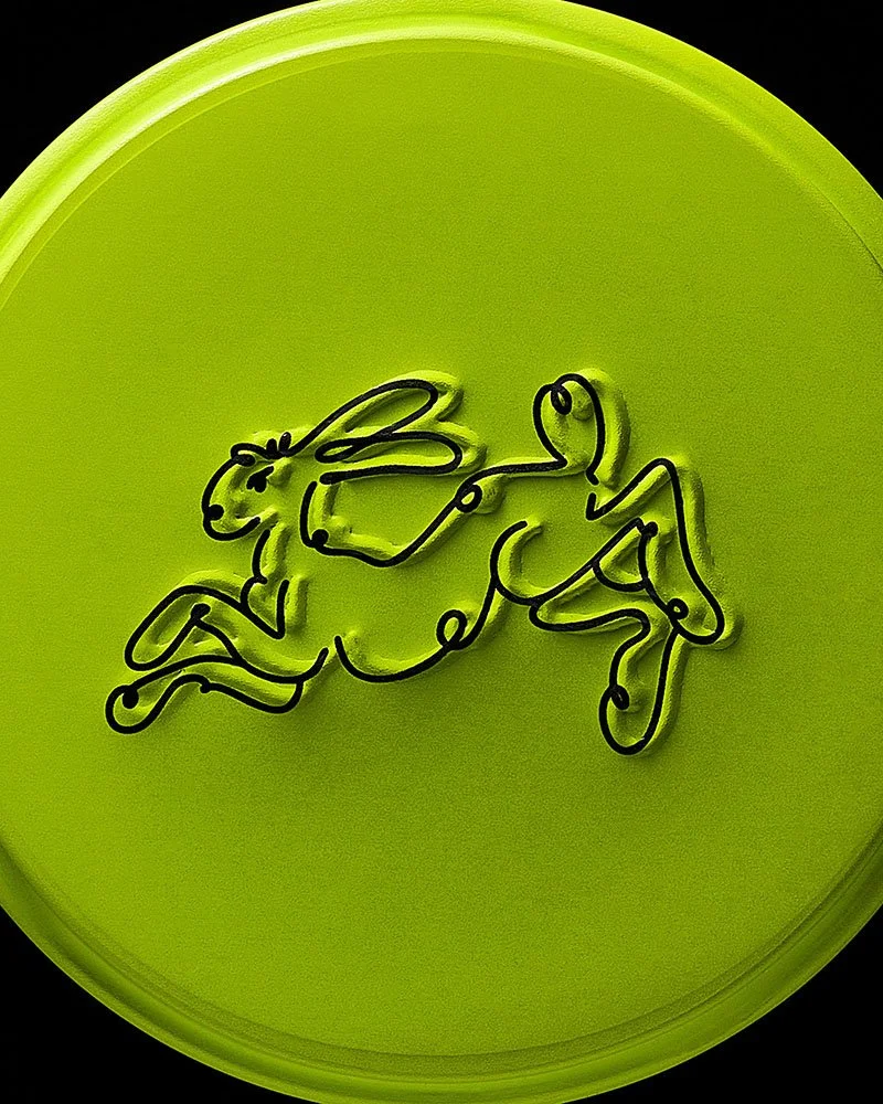
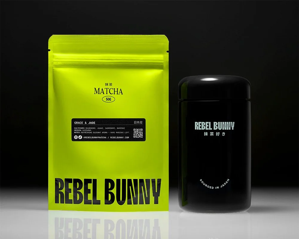
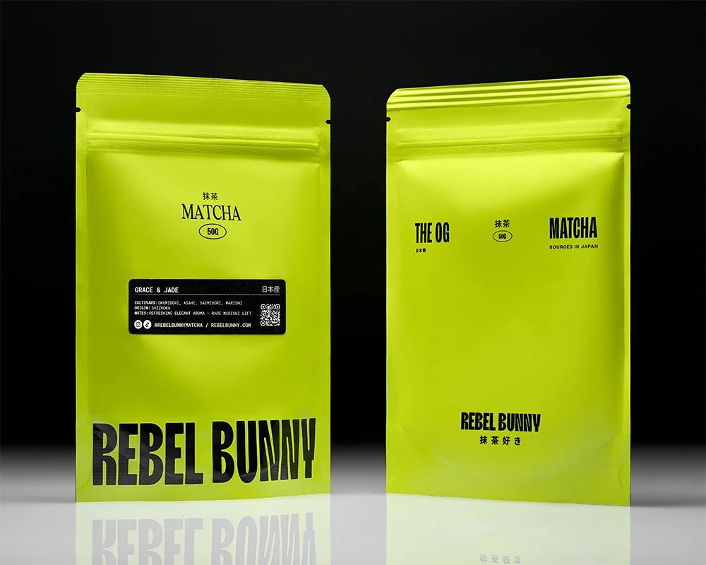
The cartons introduce typography, color blocks, edges, repetition, and graphic contrast. The matcha adds texture, density, and an organic counterpoint to the harder geometry of the packaging. Those elements can be reorganized from frame to frame without requiring an entirely new visual concept each time.
Some images give the product clear priority. Others allow the packaging to carry more of the composition. In several frames, the distinction becomes less important because the product, packaging, and matcha are functioning together as shape, color, and surface.
That flexibility creates range without breaking the visual system.
Consistency without repetition
A cohesive image library does not require every frame to use the same composition, background, or hierarchy.
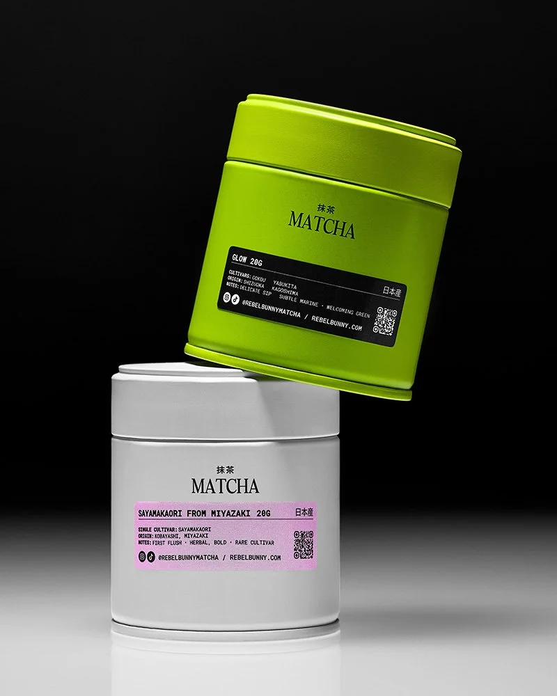
In this series, continuity comes from a smaller set of repeated decisions: controlled lighting, graphic framing, deliberate use of negative space, and a consistent relationship between product scale and surrounding elements.
Those constants make it possible for the images to vary more aggressively elsewhere.
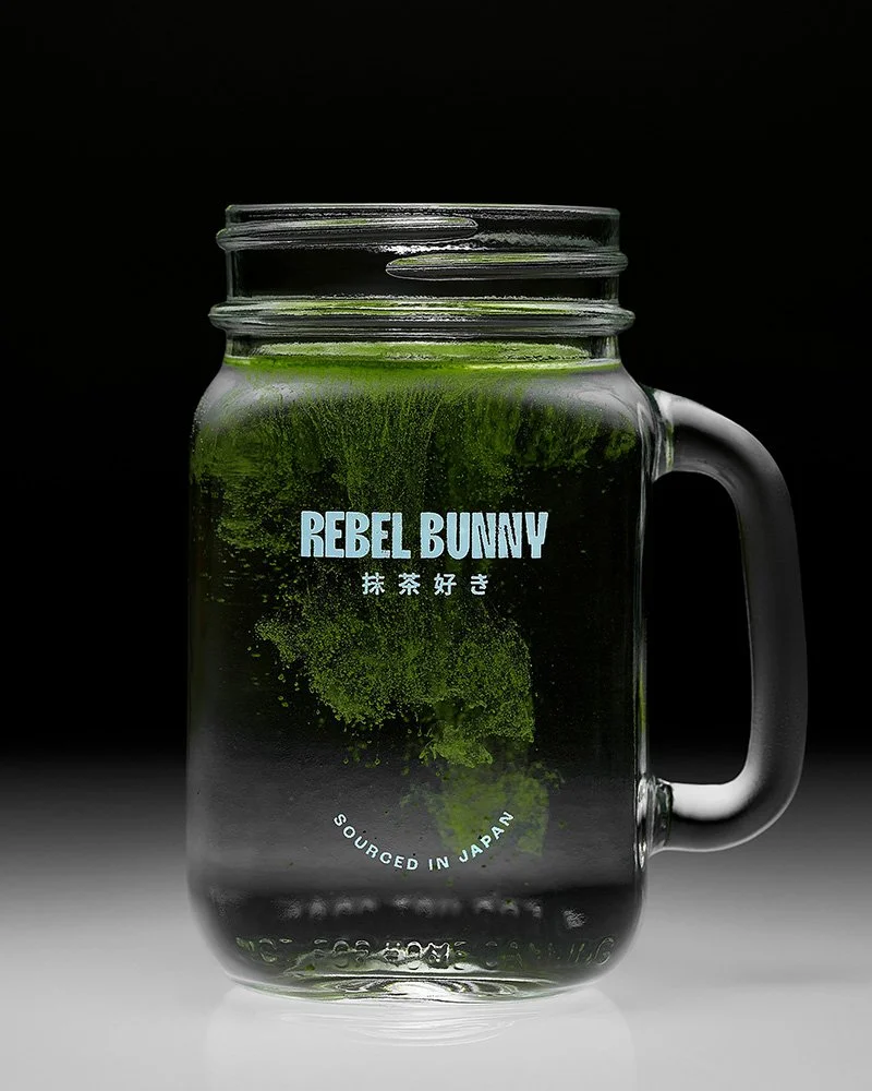
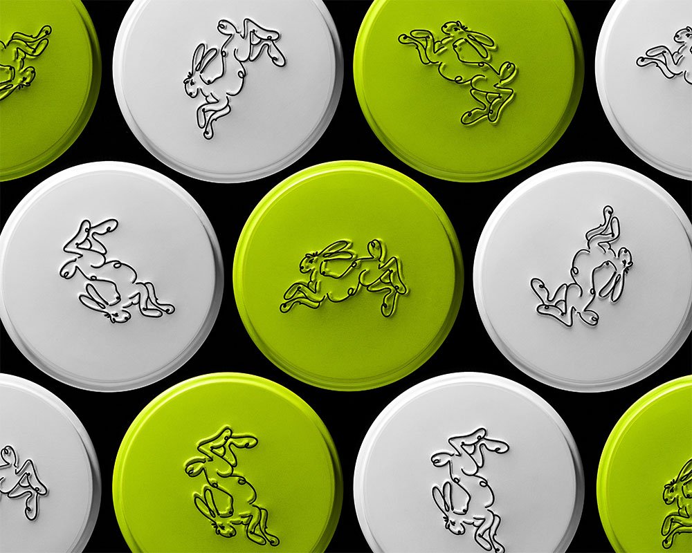
One frame can be sparse and product-led while another is denser and more graphic. Packaging can shift from supporting element to focal point. Matcha can operate as an ingredient reference in one composition and as a broader field of color and texture in another.
The images remain connected because they share a visual logic rather than a template.
Variation gives the library more range
A strong product series needs enough internal variation to remain useful beyond a single placement.
If every image solves the same compositional problem, the library may look consistent but become repetitive quickly. If each image introduces an unrelated treatment, the work may have range but no longer feel like part of the same brand world.
The more useful middle ground is controlled variation.
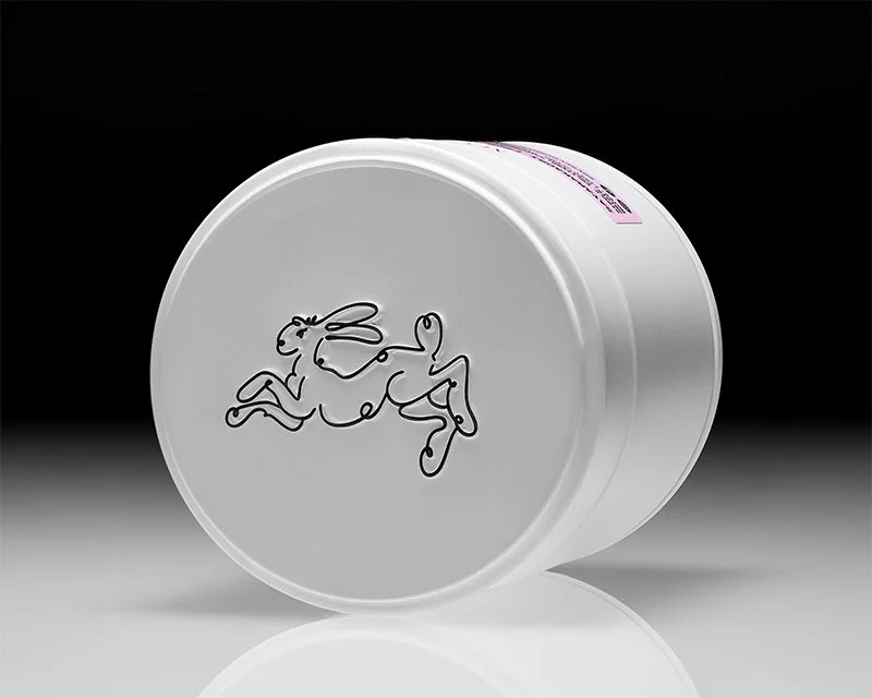
Different image roles can be built from the same core language. A direct product frame can sit beside a packaging-driven composition or a more abstract texture study without creating a break in continuity. The system is broad enough to accommodate those shifts while still keeping the series recognizable as a whole.
That makes the library more adaptable without requiring the photography to become generic.
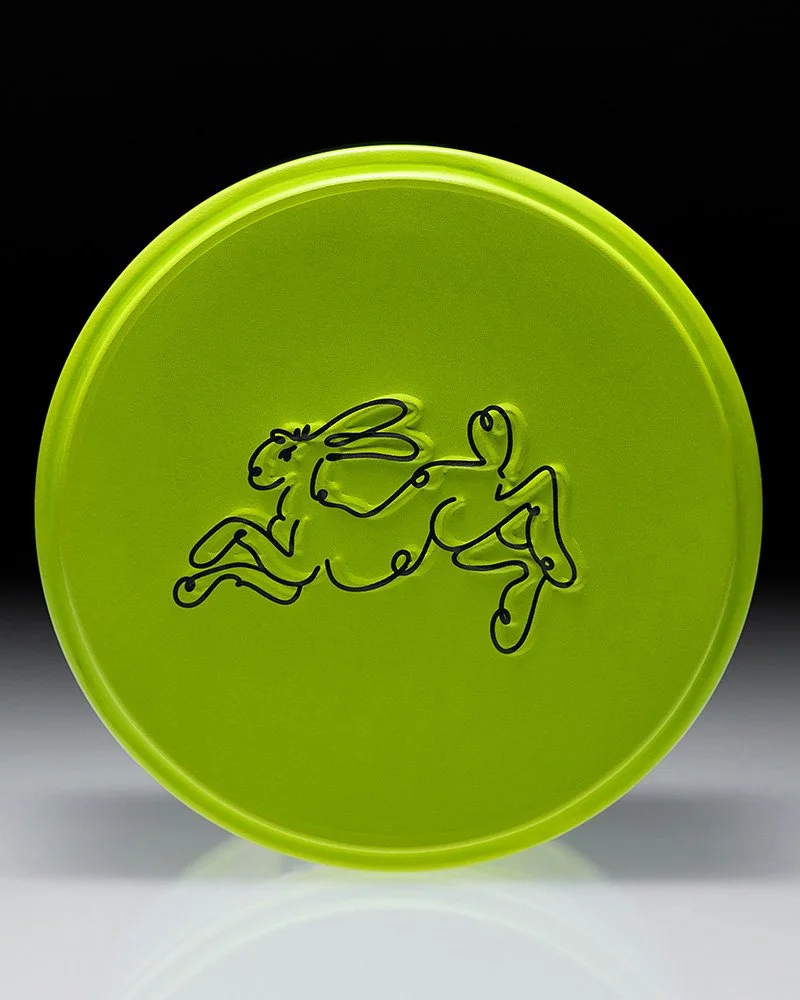
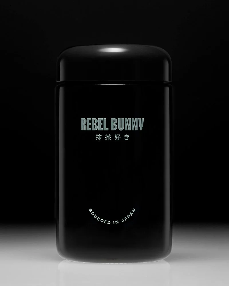
The system extended beyond the original series
The images later moved into Rebel Bunny’s own brand presence, including website and social use.
That extension is significant because it shows the value of building coherence at the series level rather than treating each photograph as an isolated deliverable. The individual frames carry different visual weight and different practical uses, but they can appear together without requiring additional explanation or styling language to connect them.
The structure is simple: a consistent photographic approach, enough variation to create range, and enough respect for the packaging to let the brand identity remain visible.
The result is not a set of interchangeable images. It is a system with enough internal logic to hold difference.
Planning a campaign or product shoot?
I help brands define the image library they actually need before production begins, then build still-life and product imagery designed to work across the full rollout.