
September jewelry still life study: form, color, and composition
This month I continued building my jewelry photography portfolio with a series of still life studies. Each set explores how jewelry can move beyond the standard product shot and into imagery that feels editorial, playful, and unmistakably cohesive.
September’s work centered on three ideas:
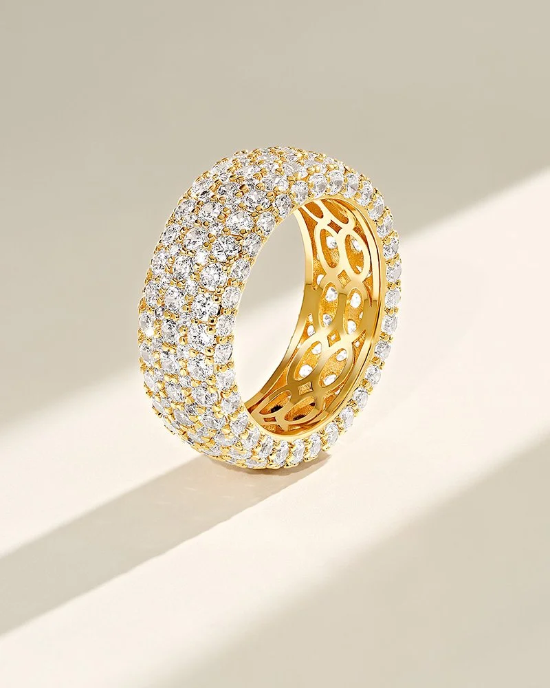
Bold forms: using light and shadow to give jewelry presence and sculptural weight
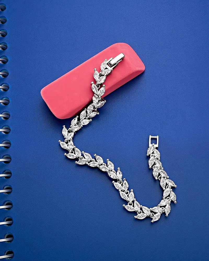
Clean color: creating compositions that feel sharp, minimal, and visually striking
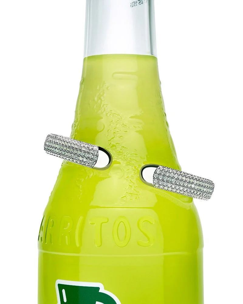
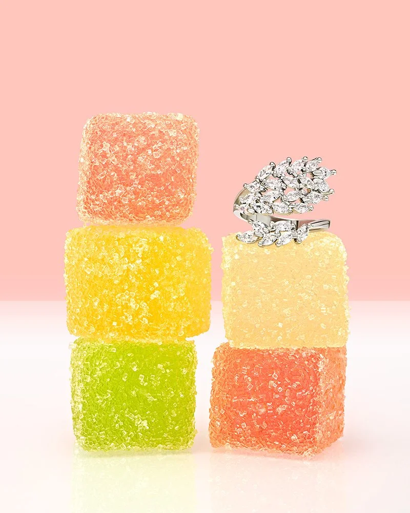
Playful context: introducing unexpected props to invite curiosity and add narrative
Why consistency matters
Jewelry photography often lives across many touchpoints at once — from ecommerce and ads to social and editorial campaigns. When the imagery feels consistent, it builds trust, shortens hesitation, and strengthens brand recall. The aim of this series was not just to show products beautifully, but to show how a consistent visual language multiplies impact across channels.
Looking ahead
Building a cohesive jewelry portfolio is part of a larger plan to expand into categories where striking visuals are both a creative opportunity and a growth driver for brands. Jewelry is a natural starting point — a space where detail, polish, and storytelling intersect.
Next up, I’ll be sharing work in cosmetics and fragrance photography, part of my ongoing focus on creating visuals that balance polish with play.
Further reading
Read how inconsistency quietly erodes trust, slows conversion, and the hidden costs of inconsistent product photography
For frameworks to plan and strengthen your own shoots, visit the Creative tools page
Planning a shoot? Start here:
Run the Pre-production checklist
Then map scope with the Visual asset planning worksheet
Use the Pricing guide to understand cost
Review the Licensing guide to define usage